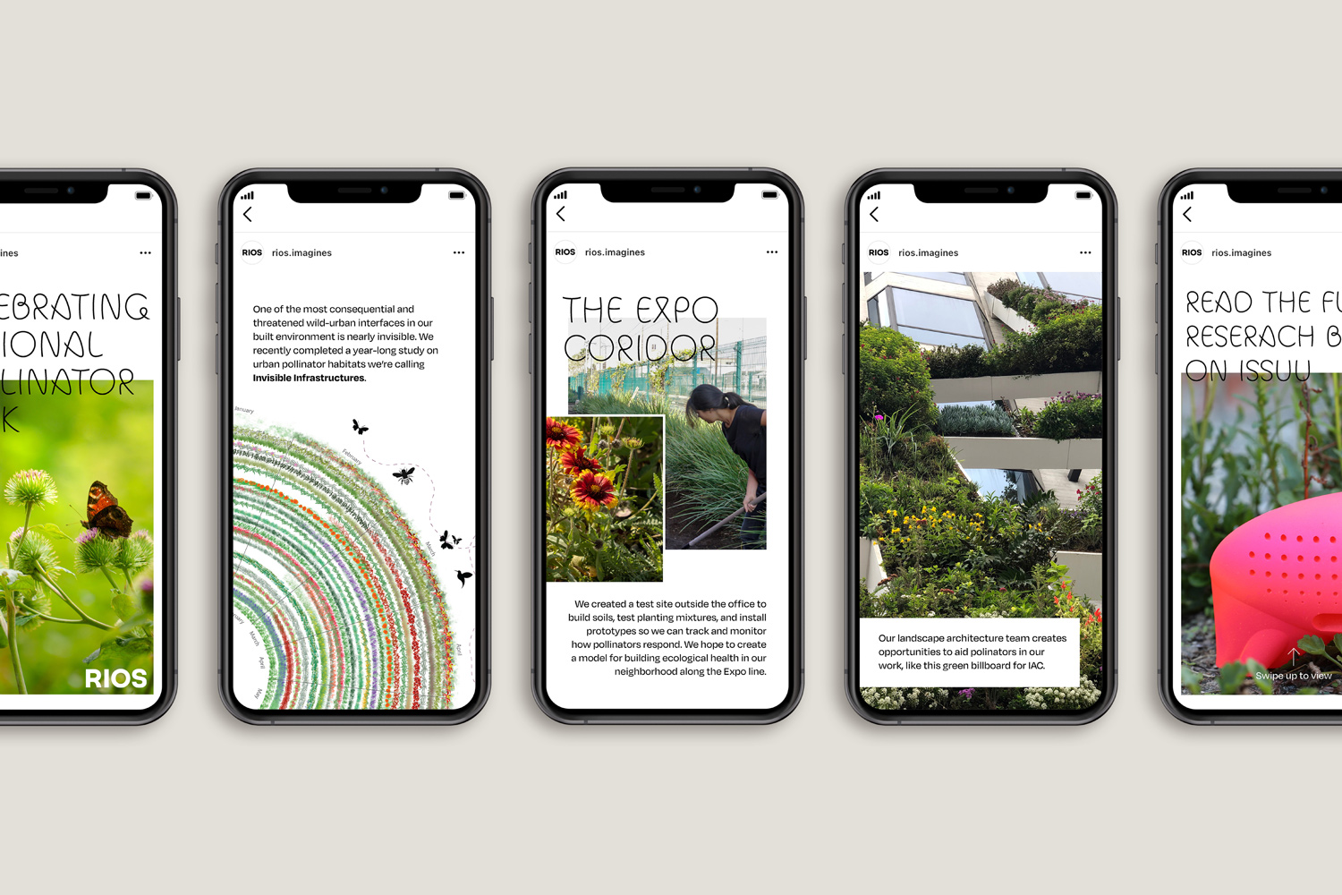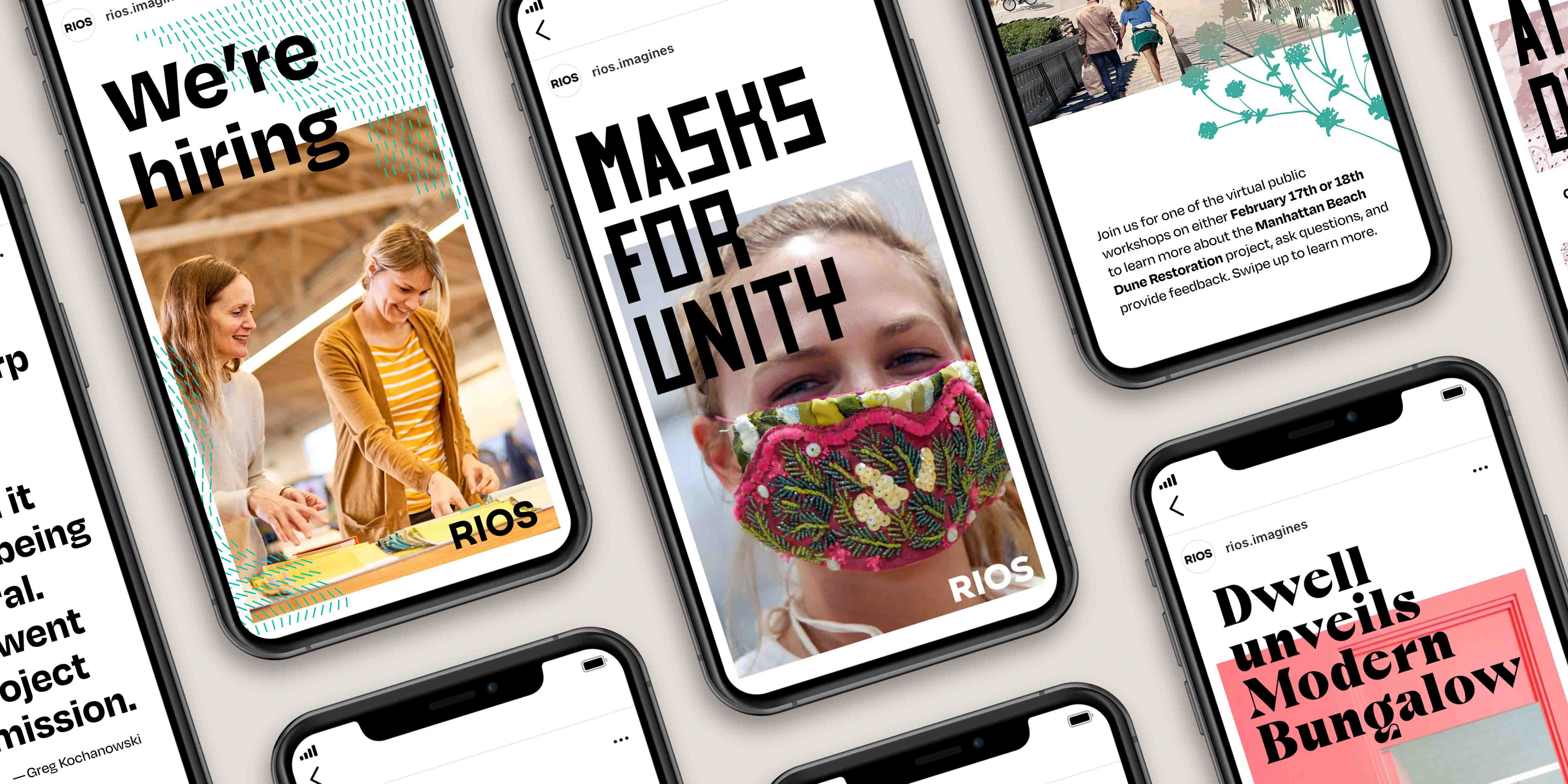
RIOS Brand as seen on Instagram Stories
RIOS’ brand identity is a dynamic and self-renewing kit of parts designed to communicate and celebrate our firm’s transformative projects and ideas.
This set of graphic guidelines is designed to highlight the many design voices that represent RIOS as a collective and amplify the story of each individual or project. The brand brings an inventive approach with expressive moments to promote our multidisciplinary work. By combining rigorous layout guidelines with a flexible system of display fonts and patterns, the brand can accommodate many campaigns and points of view while remaining recognizable across platforms.
The RIOS logo is a strong and simple anchor, representing the unity of our studio
As our firm continued to grow, we realized that the former brand no longer accurately communicated our true strengths and identity. We initiated our redesign by asking a few guiding questions — How could we visually communicate RIOS as a true collective comprised of unique voices and wide-ranging expertise? How could we demonstrate the firm’s commitment to working beyond boundaries on the cutting edge of design innovation? And most importantly, how could we create a flexible brand identity, easily adoptable by each designer to fit the needs of their projects while still recognizable as RIOS?
Our answers surfaced through extensive research. We interviewed employees to understand their points of view and visions for the future. We had fruitful discussions with clients and collaborators to discern how they viewed us and discover opportunities to better support and engage them.
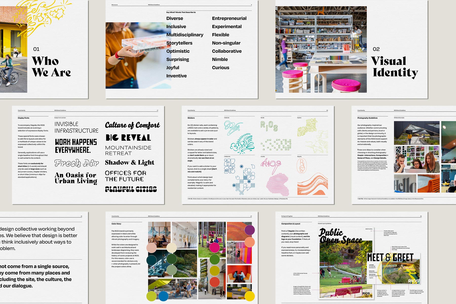
The robust brand guidelines clearly outlines the design toolkit and guiding principles, while giving each individual designer the freedom to make it their own
The brand empowers teams with a palette of expressive and flexible tools that allow each designer and project to maintain a unique voice within a larger recognizable brand presence. These tools include a curated collection of display typefaces that support a multitude of unique voices, a color palette inspired by our work and calibrated to provide a variety of combinations, and six distinct sticker sets to express and embellish a project or campaign, each bringing personality and joy. The sticker sets are rooted in uplifting themes including Celebrate, Collaborate, Explore, Iterate, Amplify, and Magnify.
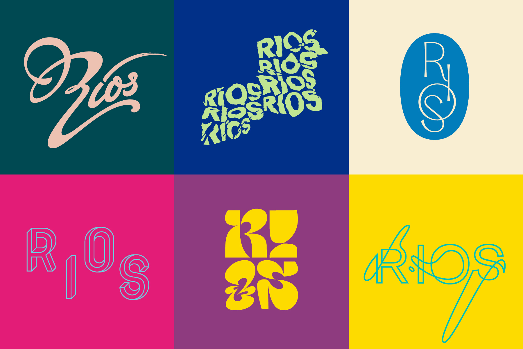
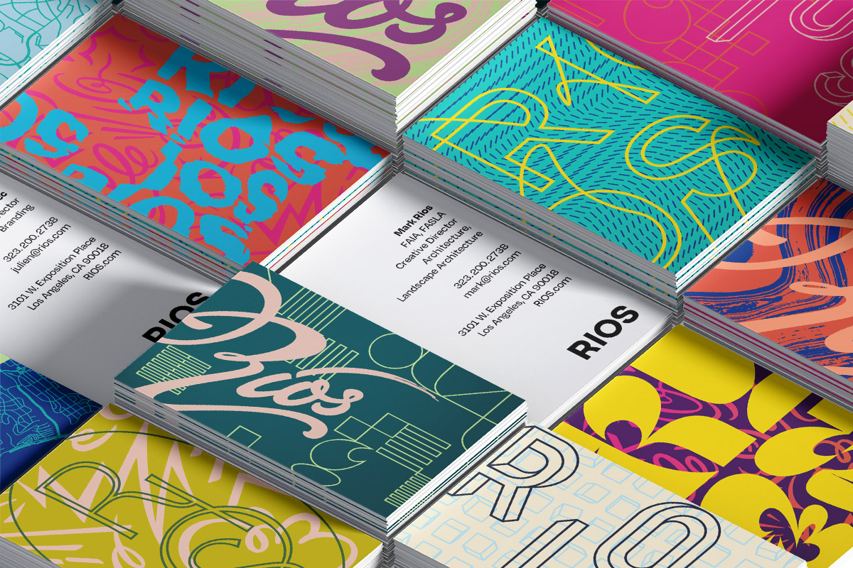
The identity is flexible and can be continually reconfigured from the core toolkit
Individual layouts and larger systems maintain a ratio of 70% easily legible content to 30% expressive design. This deliberate contrast allows important content to be clear and vibrant graphics to shine. From social media graphics to project proposals and client presentations, the brand uses elements that are layered over each other in a prescribed way to capture the depth and complexity of RIOS.
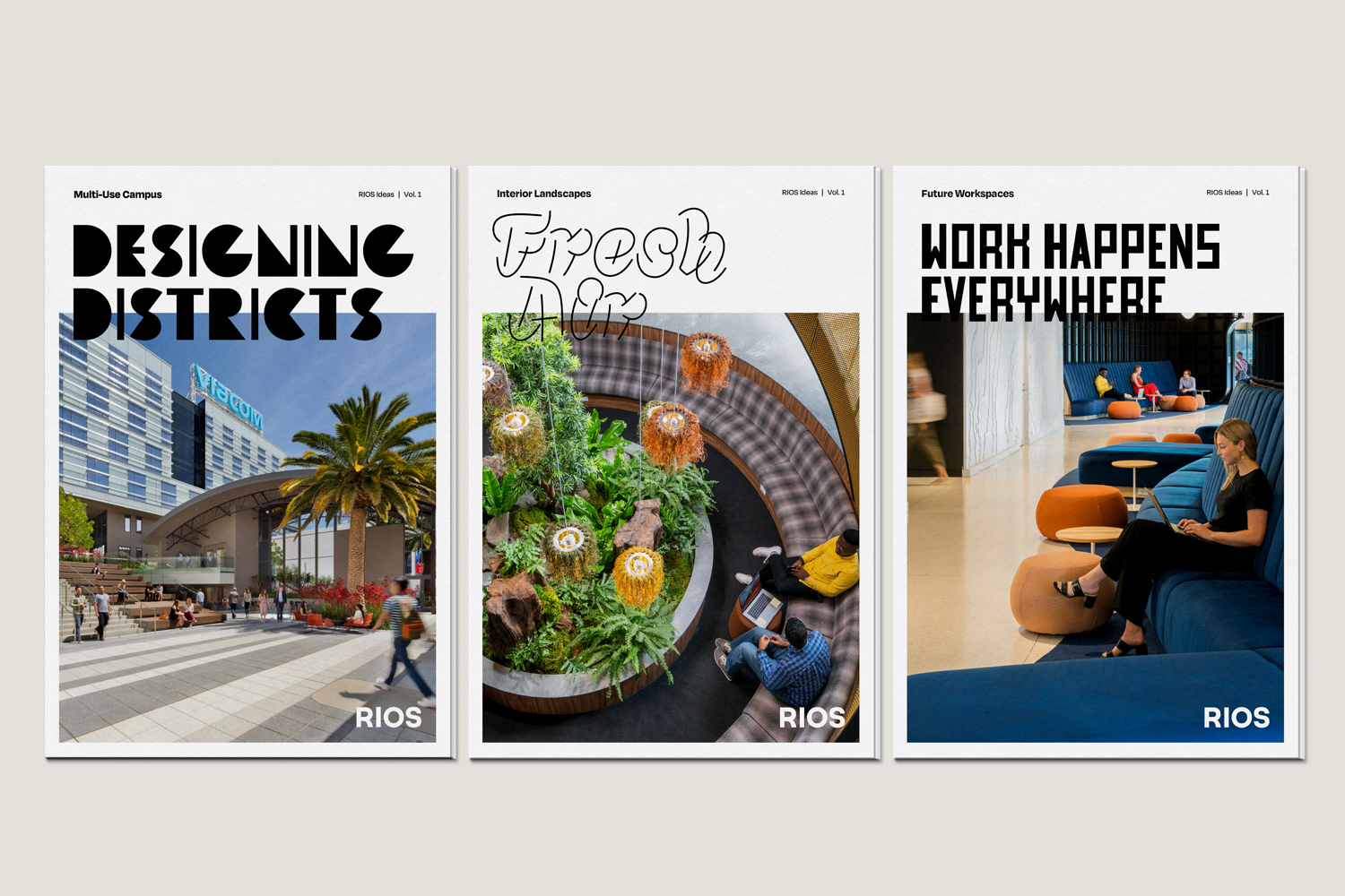
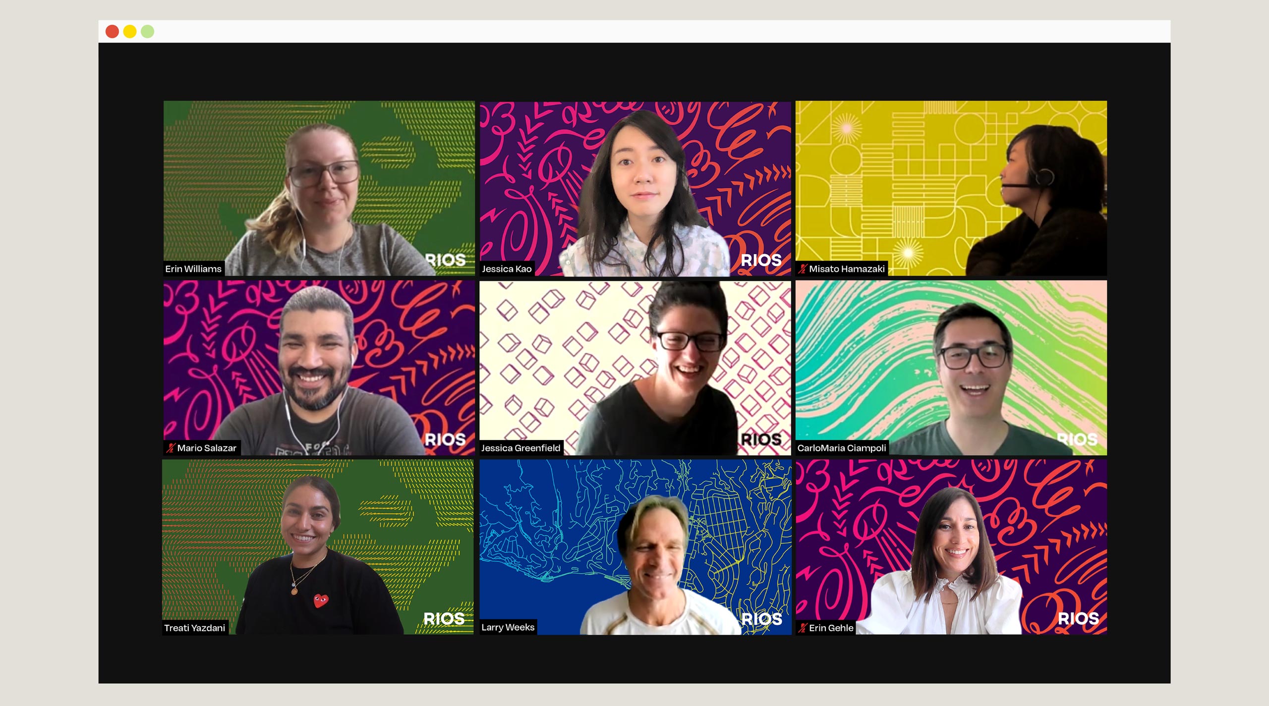
The diverse selection of expressive typefaces and photography are used across publication covers to establish unique identities for our various strategic initiatives. The brand is also used in social media campaigns that balance individual points of view with a consistent brand presence, as well as branded Zoom backgrounds as a creative way for employees to be instantly recognized in online meetings with clients and collaborators.
