South Park Wayfinding
Marking the Way
The neighborhood of South Park is experiencing a rejuvenation with new towers going up and businesses opening all the time. Some of the city’s major entertainment destinations are located in South Park — the Convention Center, Staples Center, LA Live — but visitors don’t always realize all that the neighborhood has to offer. The South Park Business Improvement District (BID) approached RIOS to design wayfinding that would help visitors see that there is more to explore while enhancing the character of this developing residential neighborhood and turning a piece of visual blight into an asset.
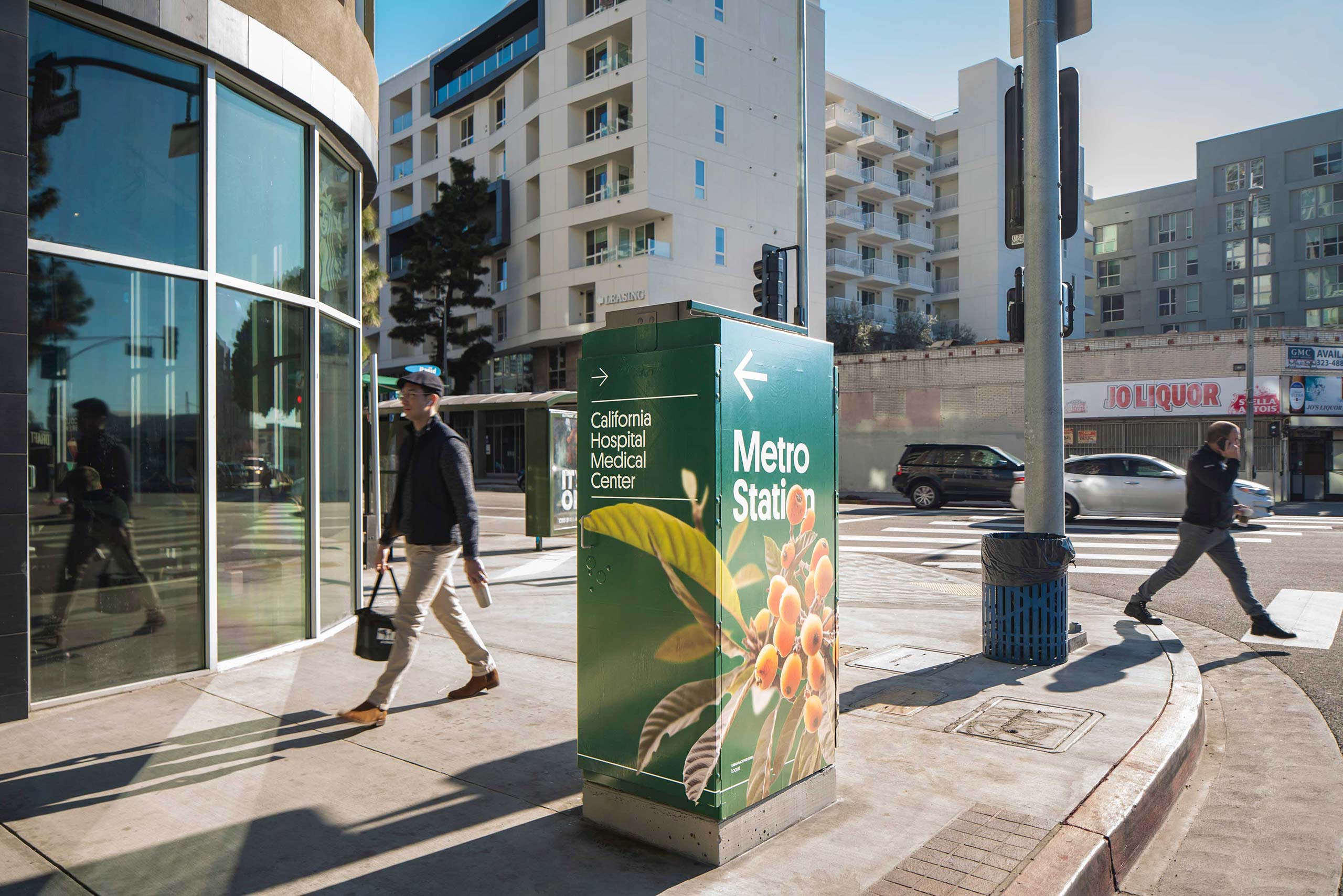
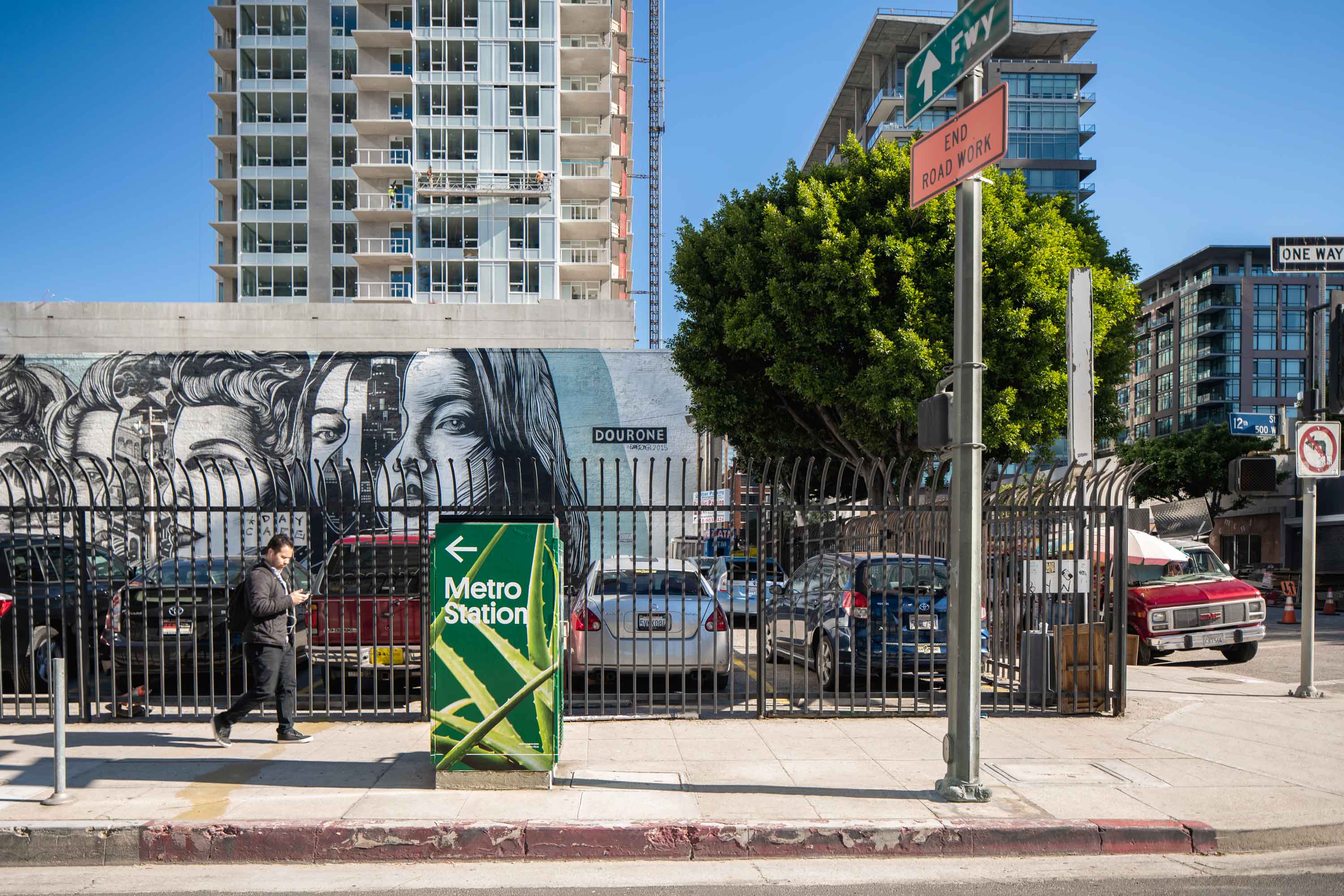
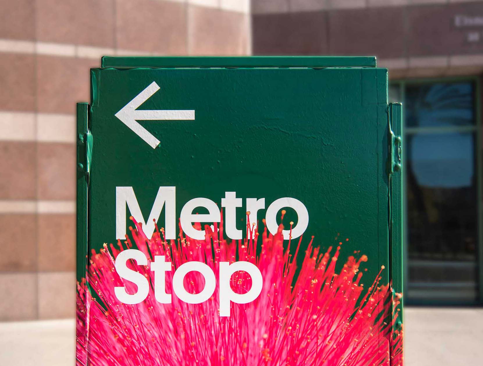
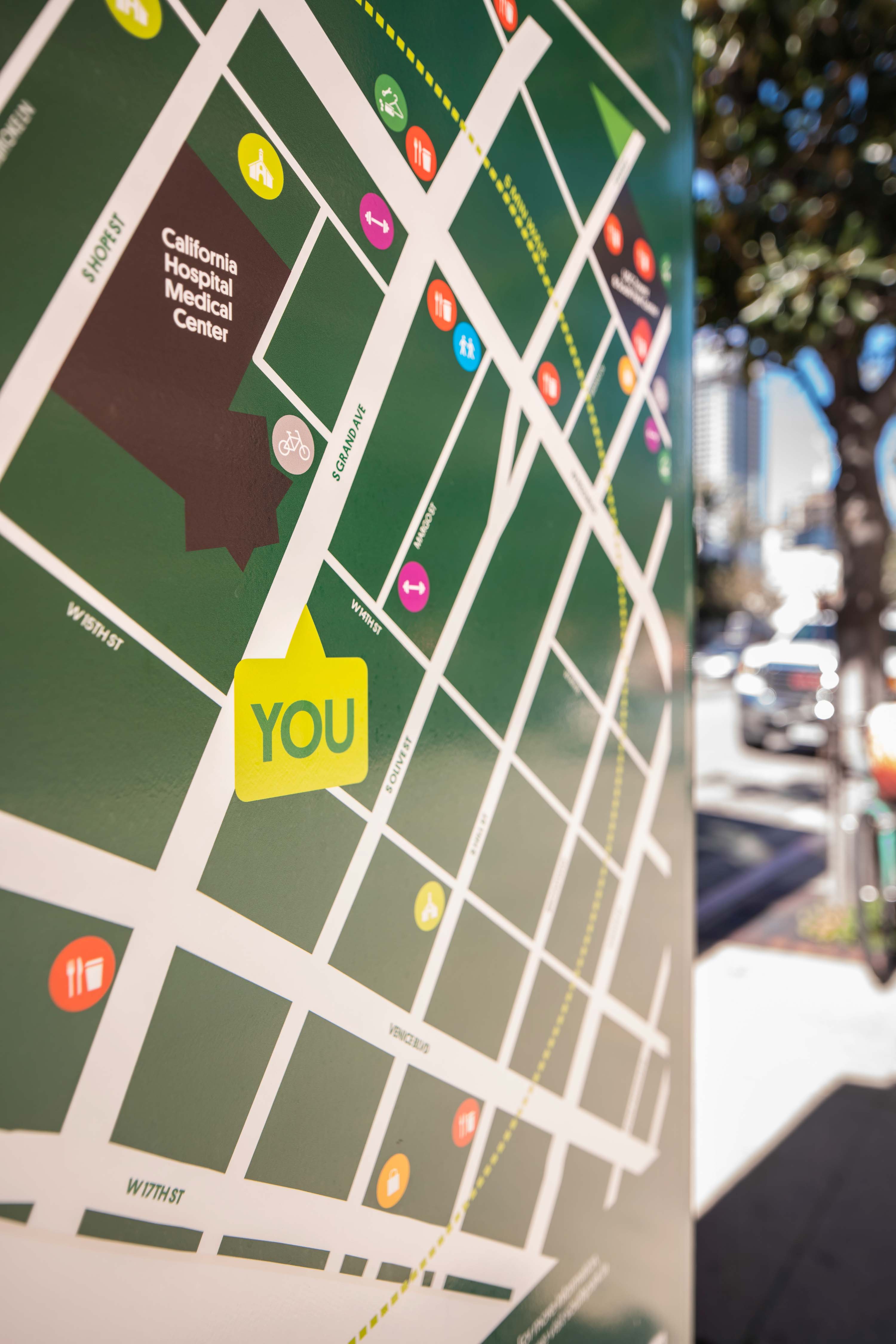
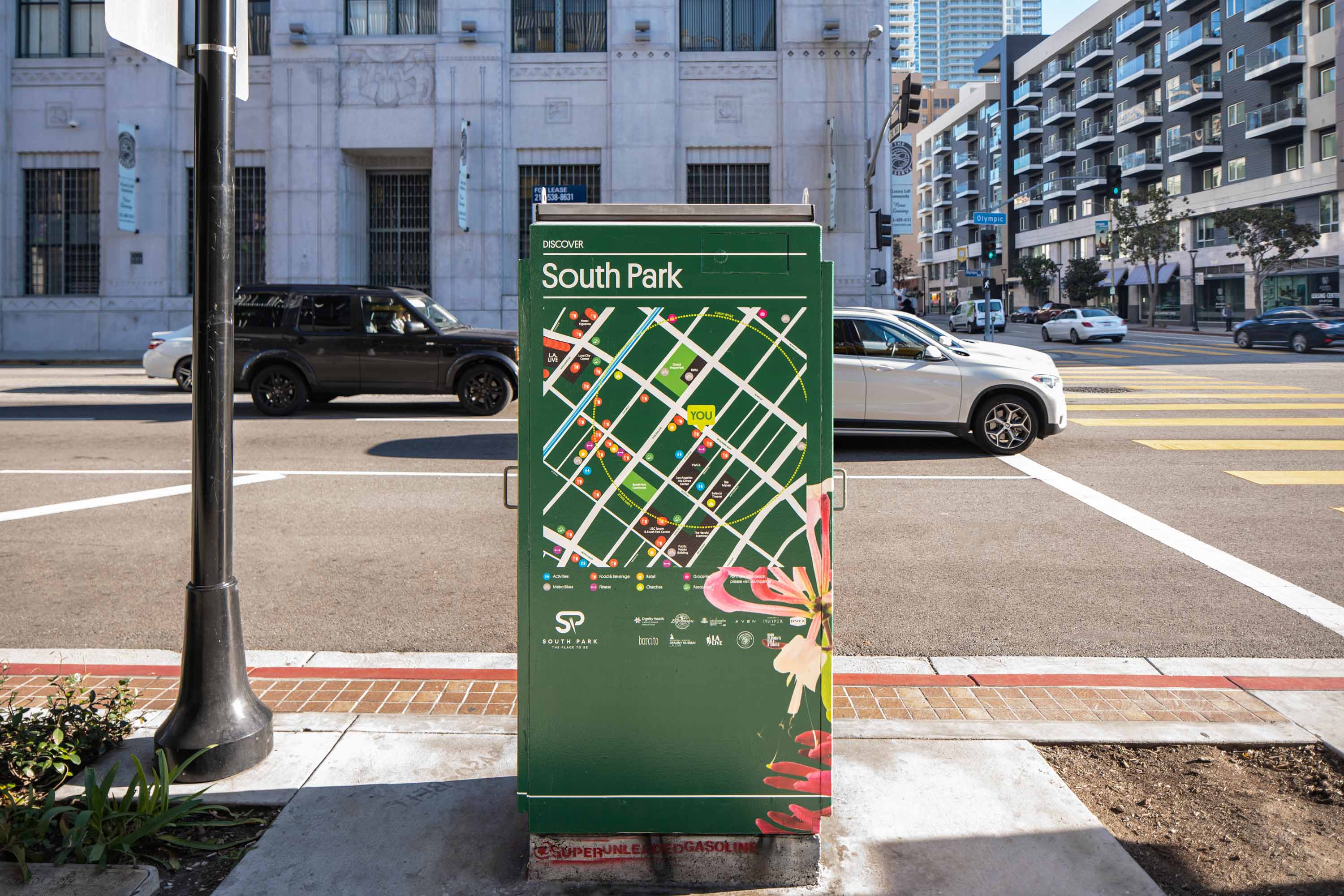
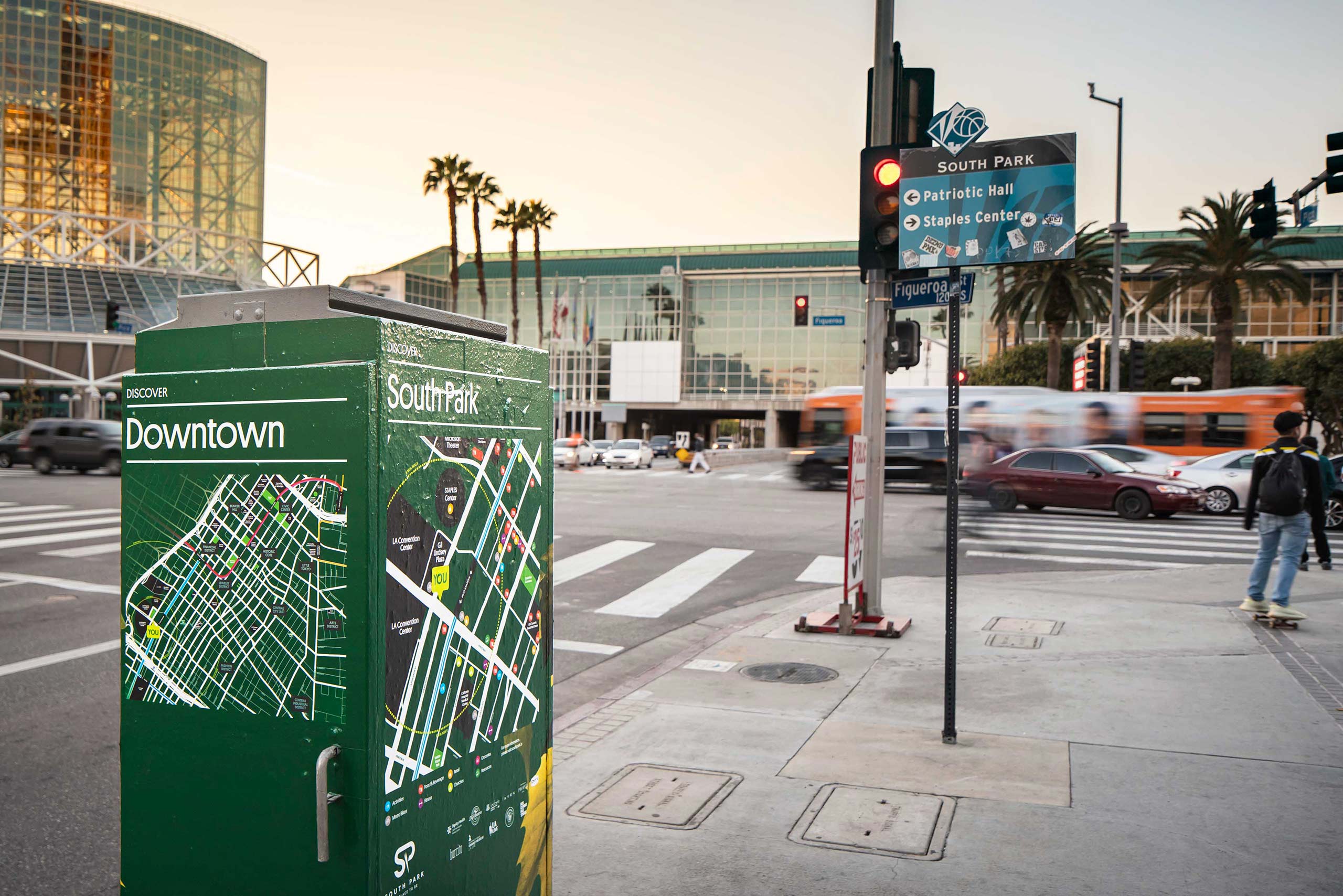
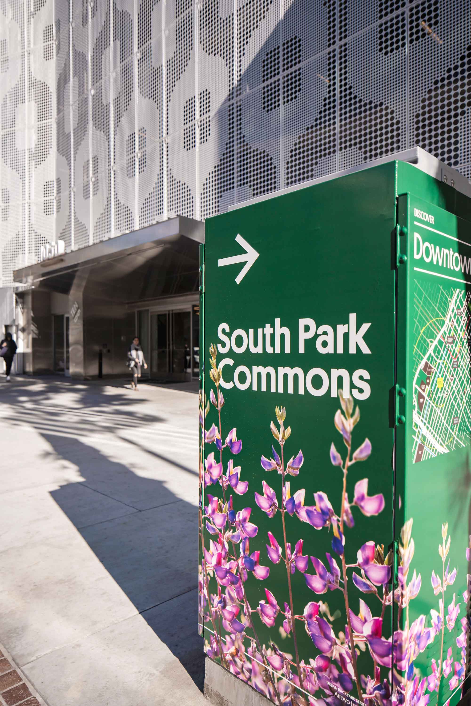
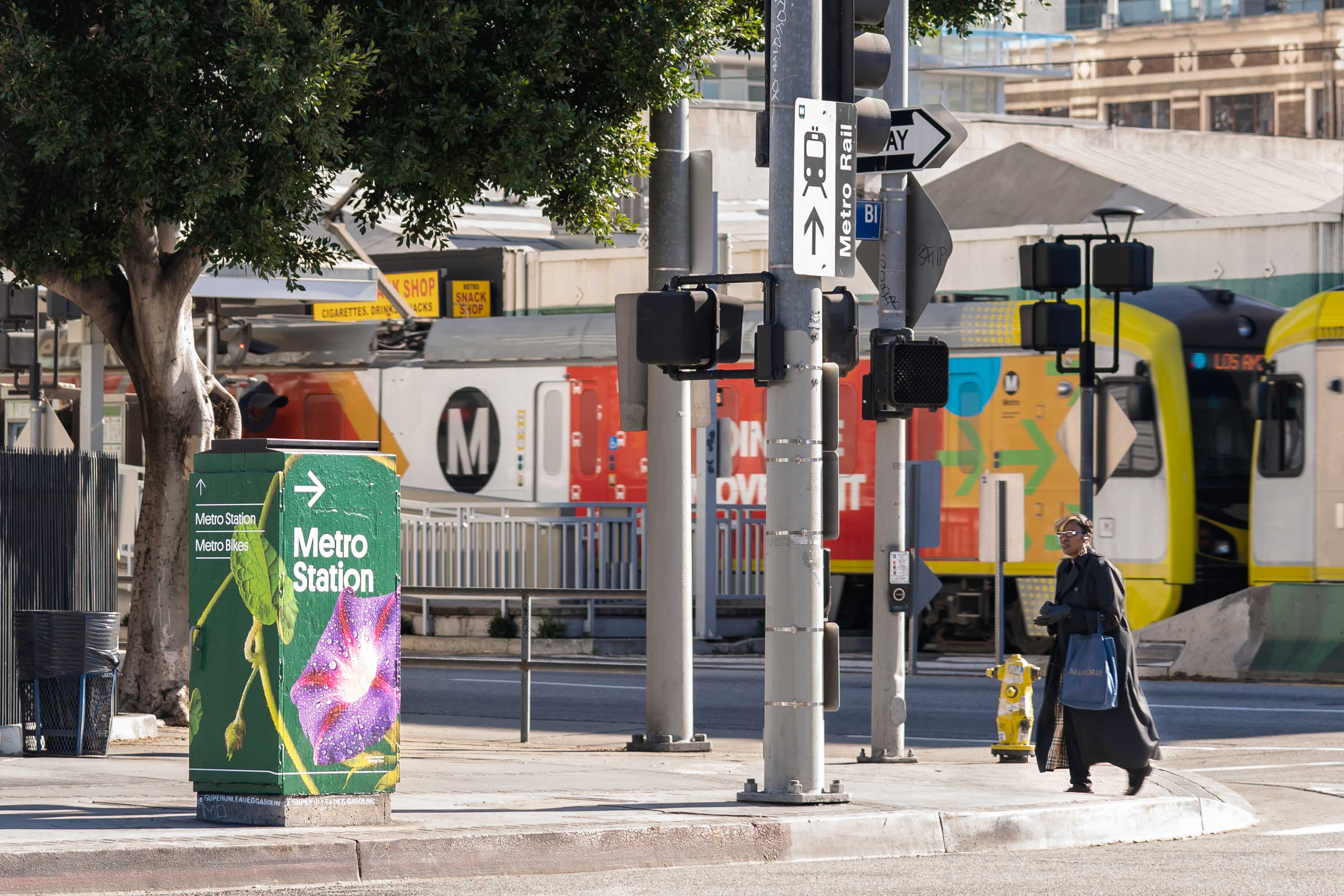
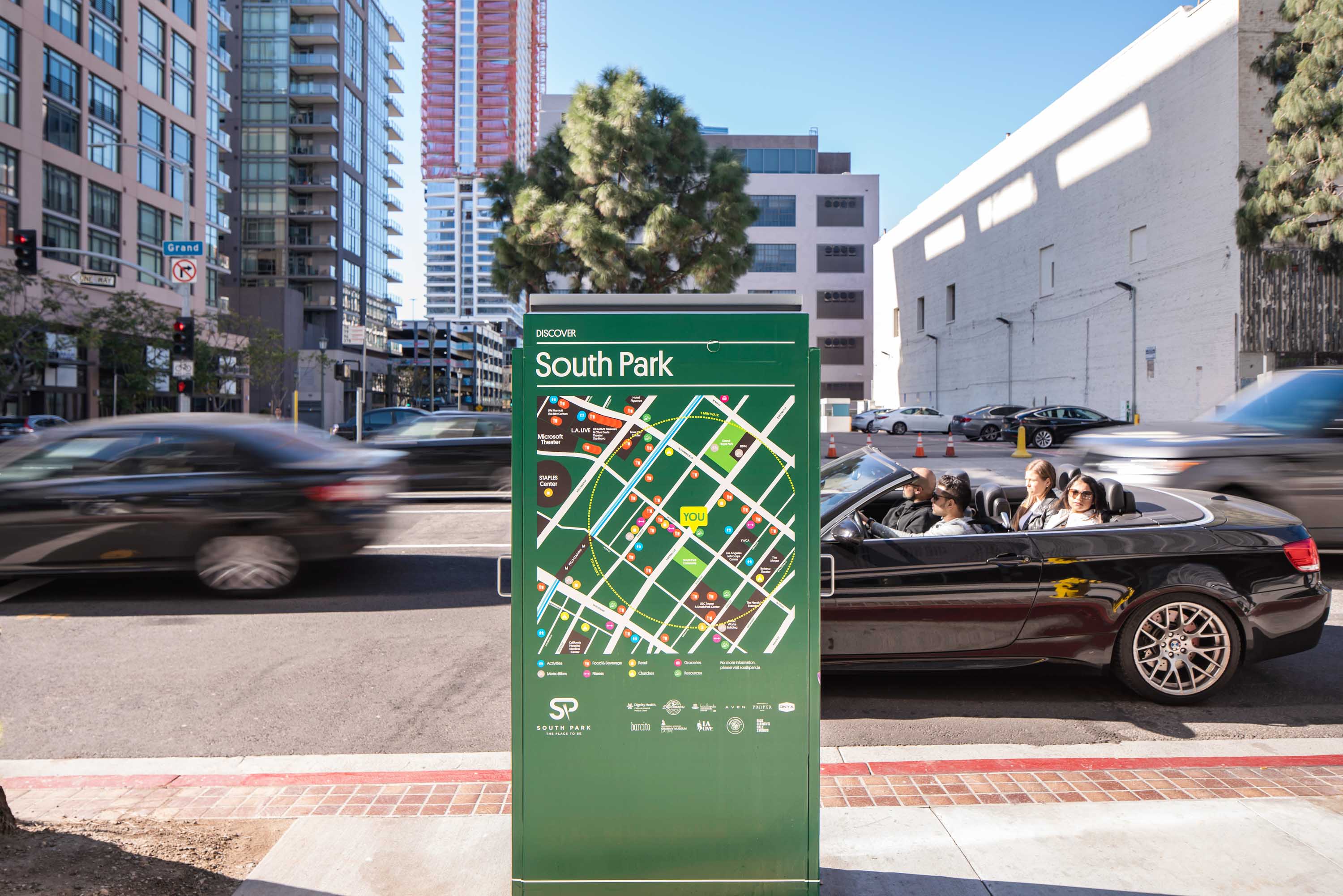
Each piece uses the full surface area of the utility boxes. On one side, pedestrian-scaled directions to nearby destinations are featured. Another shows the user a map of South Park and icons representing local businesses by category (food, drink, shopping, fitness, etc.) as well as major landmarks and transit. The third shows the context of Downtown Los Angeles, and points to which landmarks a visitor might reach within a 5 minute walk versus a 15 minute walk. The final side shows a single major destination at a vehicular scale.
Each box is wrapped in a different botanical design to add to the residential character of the neighborhood, selected with care to resemble what Angelenos plant in our own backyards. Look closely to spot our designers having a bit of fun with the flowers on Flower Street, the Figs on Figueroa, or the Royal Palm outside of the historic Palm Restaurant. The foundational dark green color was chosen both with the existing South Park BID brand in mind, and also as a nod to the most common coloring in street furniture.
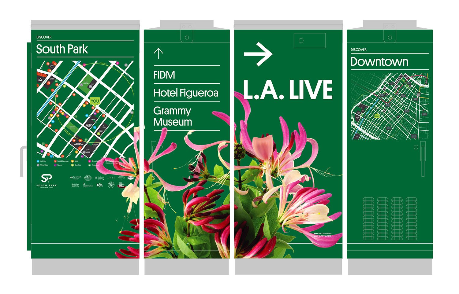
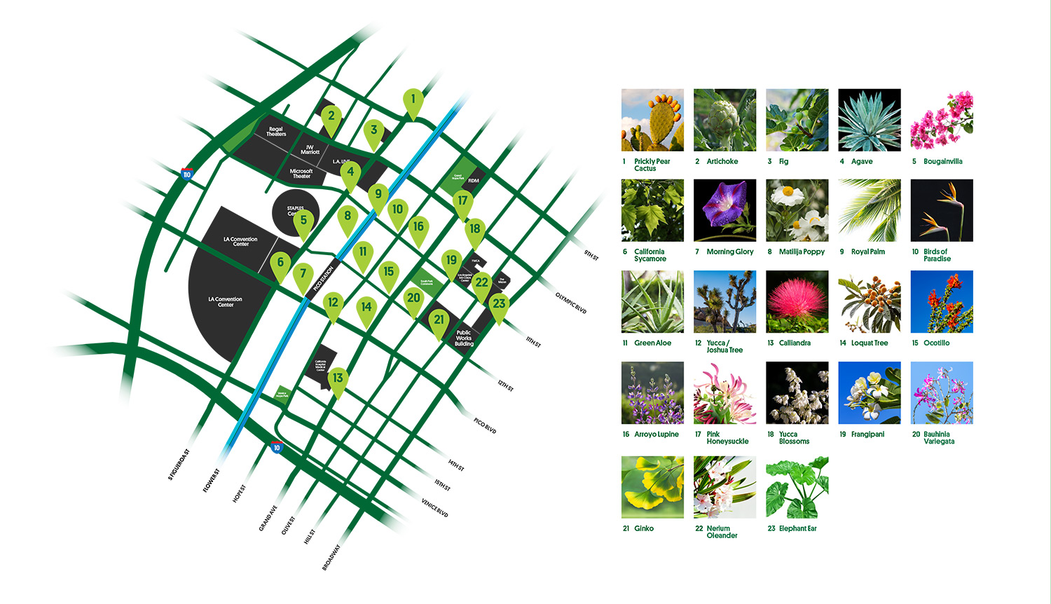
This project minimizes new material use by adding purpose to an existing urban feature. Furthermore, the maps were developed using strategies to minimize the amount of reprinting needed as new businesses are added to the district. Only major institutions are listed by name, all others are represented with icons to indicate the type of business. This way new businesses can be added using just a sticker, and by holding a hard border on each of the maps we’ve enabled the client to reprint just the map area without redoing the entire box when necessary.
We also hope that these contribute to a more walkable and bikeable environment on a fundamental level, by empowering people to reach destinations they may not have realized were within reach, or have more confidence adjusting their route plans on the go.
