The logo is not the brand.
Don’t get me wrong, a good logo is a powerful thing. But it’s often a thing that is really designed to communicate that something is a part of a larger system—that this product comes from a certain designer, or this building is a part of that familiar chain. But more and more we’re seeing projects where the place and the experience you might have there are the essence of the brand, not an extension of one, and are entirely unique. Think parks, airports, or outdoor markets, where the identity has a different job to do: uniting and memorializing the story that is contained within. We call this “place-led” branding, because the place takes the lead instead of the other way around.
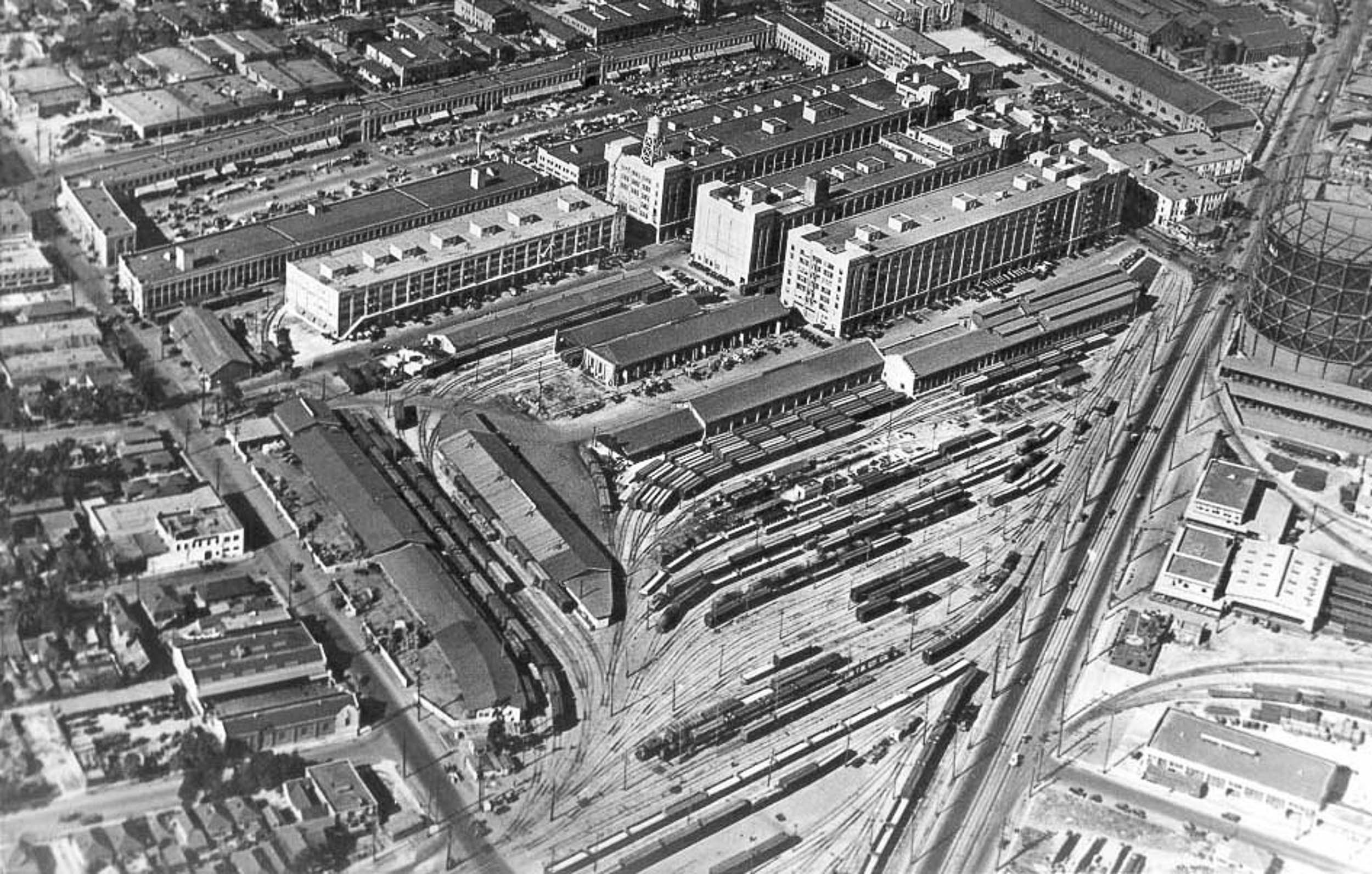
A historic photo showing the Produce Market’s long row-style buildings where trains pulled up along one side and trucks and carts loaded their goods along the other side
So, how can we let the place take the lead? At the new downtown development ROW DTLA, we worked across disciplines to reveal the story and enhance the character of the place. The produce market has been active on site for 100 years, but got a new lease on life when the historic warehouses on site were converted from industrial use to a dynamic combination of creative office and retail, and the streets opened up to a variety of cultural events. This site represented a design challenge in its scale and complexity, and an amazing opportunity to think about how we handle an urban environment heading into its next phase of life.
A few things we learned along the way:
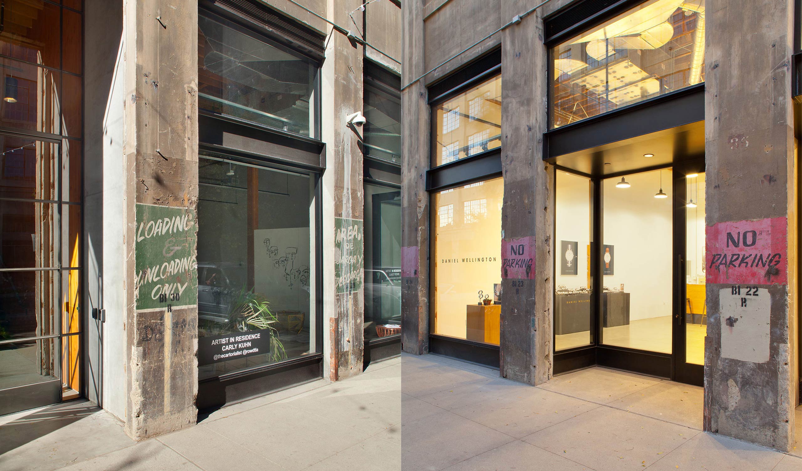
Layers of the site’s past remained throughout the development – faded signage, timeworn concrete, and a gritty patina that was important to retaining a bit of the history of the Produce Market past. A fresh skim-coat would have wiped these important imprints away, while celebrating them gives the site an authenticity that can’t be recreated. As such, the signage solution was conceived as a series of layers designed so that the user perceives the wayfinding and site data in an organic way.
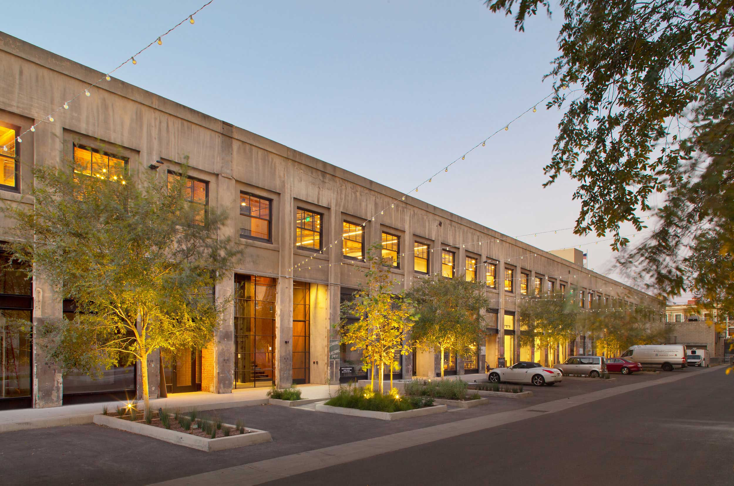
The site underwent a massive change when it was converted from a private, single-use site to a walkable, public property containing 1.3 million square feet of creative office, 50 shops and restaurants, and a parking garage. As a result, it was important that the first layer of the solution be a pragmatic layer that supported the critical intervention and pedestrian experience that was transforming this area.
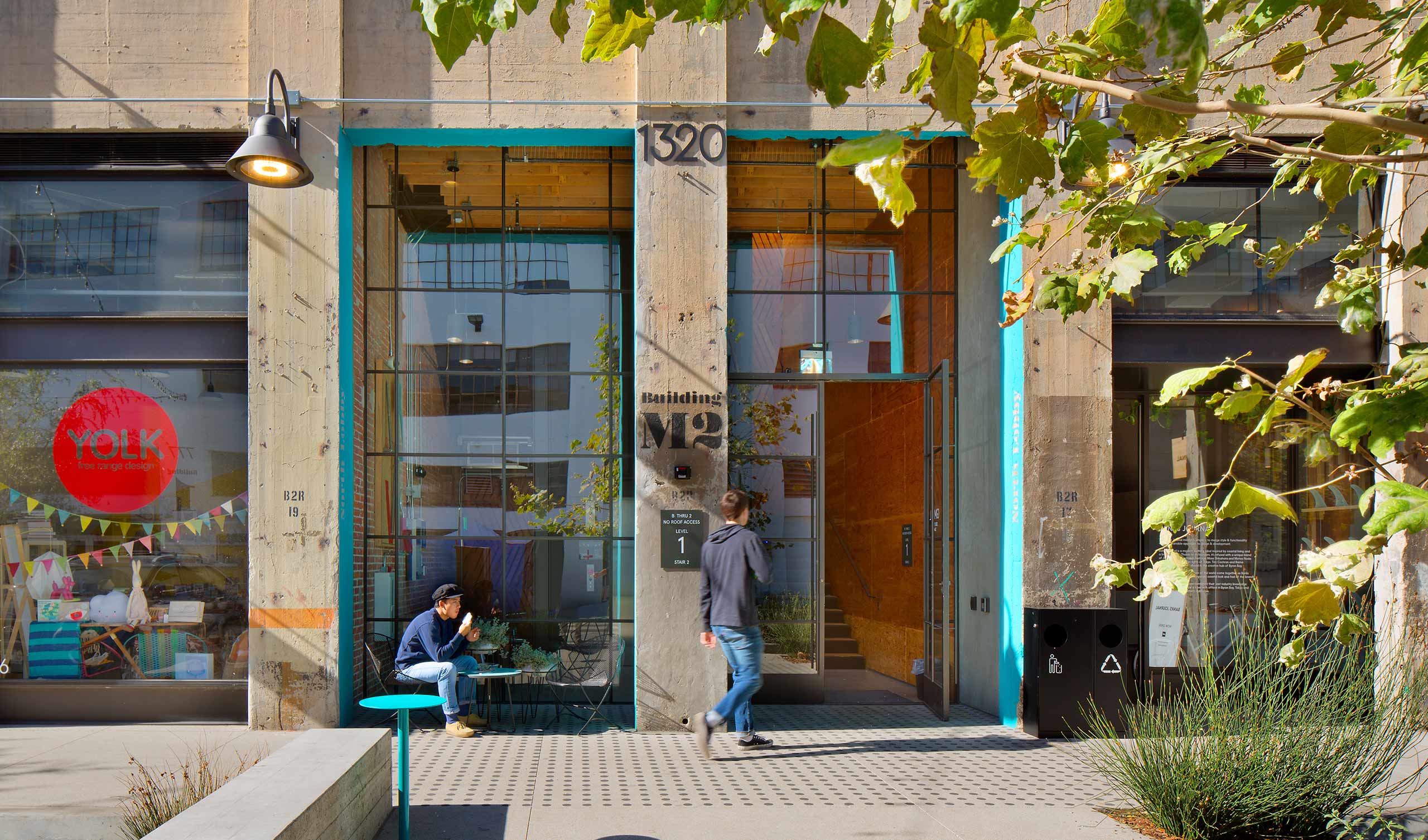
While there are many ways to preserve the forces at work on a site, the idea of rehabilitation was most in line with the goals of the site. Rehabilitation acknowledges the need to alter or add to a historic property to meet continuing or changing uses while retaining the property’s historic character. This method of preservation recognizes the need for balance between the future and the past, and drove us to conjure contrast and surprise in the design solutions.
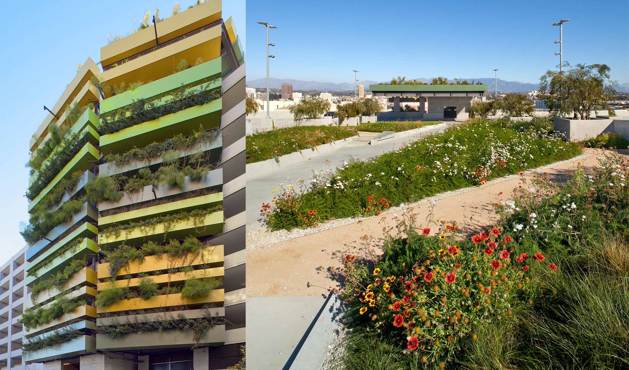
There are hidden experiences throughout ROW. Atop the parking garage, an Urban Meadow brings the rooftop to life as visitors wander through wildflowers with a panoramic view of the skyline. There is a planned irregularity in the signage: not everything is a signed moment; not every signage instance is the same. The solutions aren’t overly branded to avoid a monolithic corporate feeling.
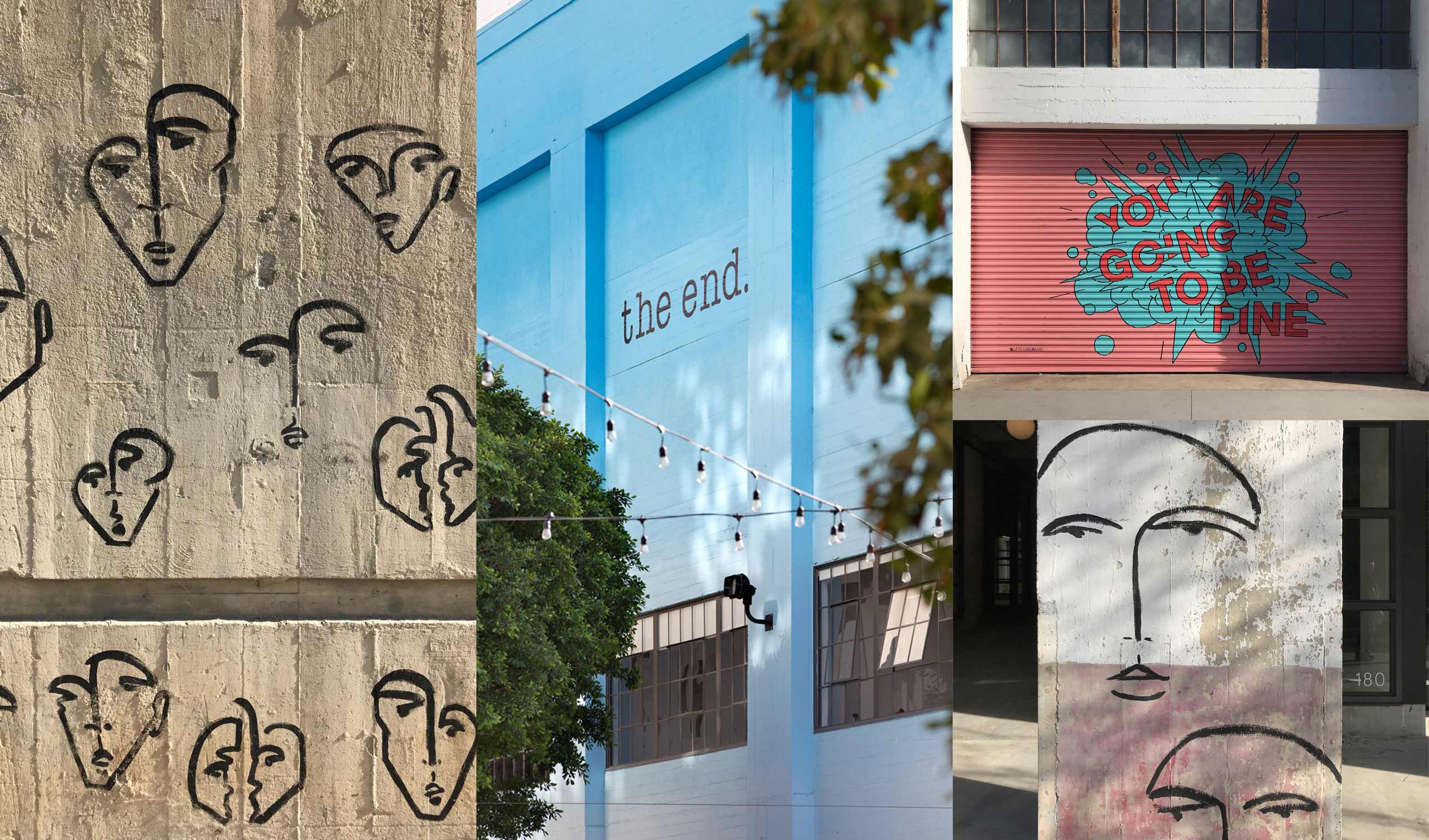
Many local artists were offered space in this burgeoning area as it developed. Embracing the local citizens is one way to create a welcome presence and ensure that the place becomes a central part of the community. At ROW, some of these artists, and more besides, were hired to create murals on site — some statement, some pattern — that are yet another layer over the evidence of the past.
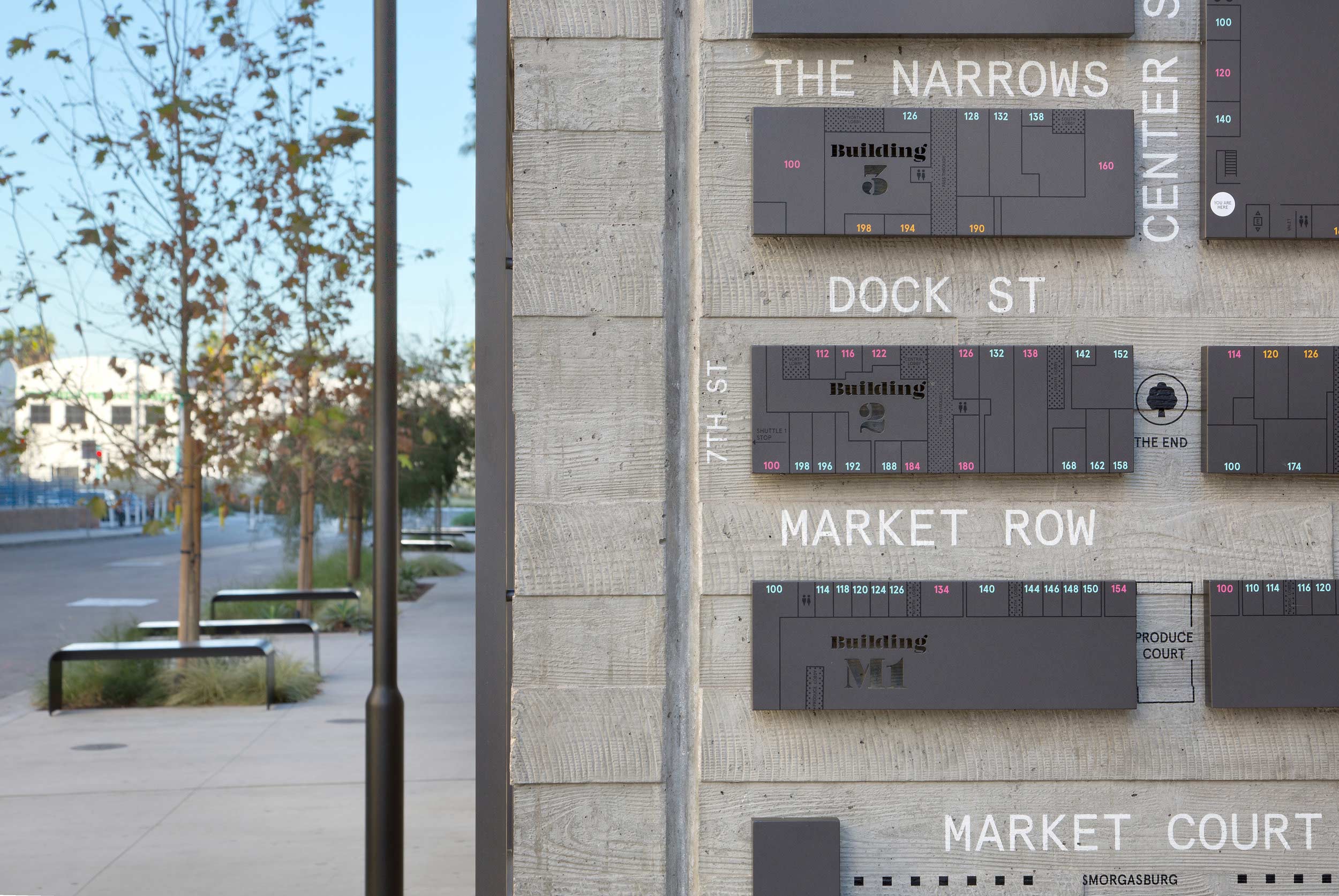
ROW is complex multi-phase project where many projects are still coming on line. It still has growing to do. It made sense to consider modular, changeable solutions that can modify and change alongside the district itself. The strategy went something like this:
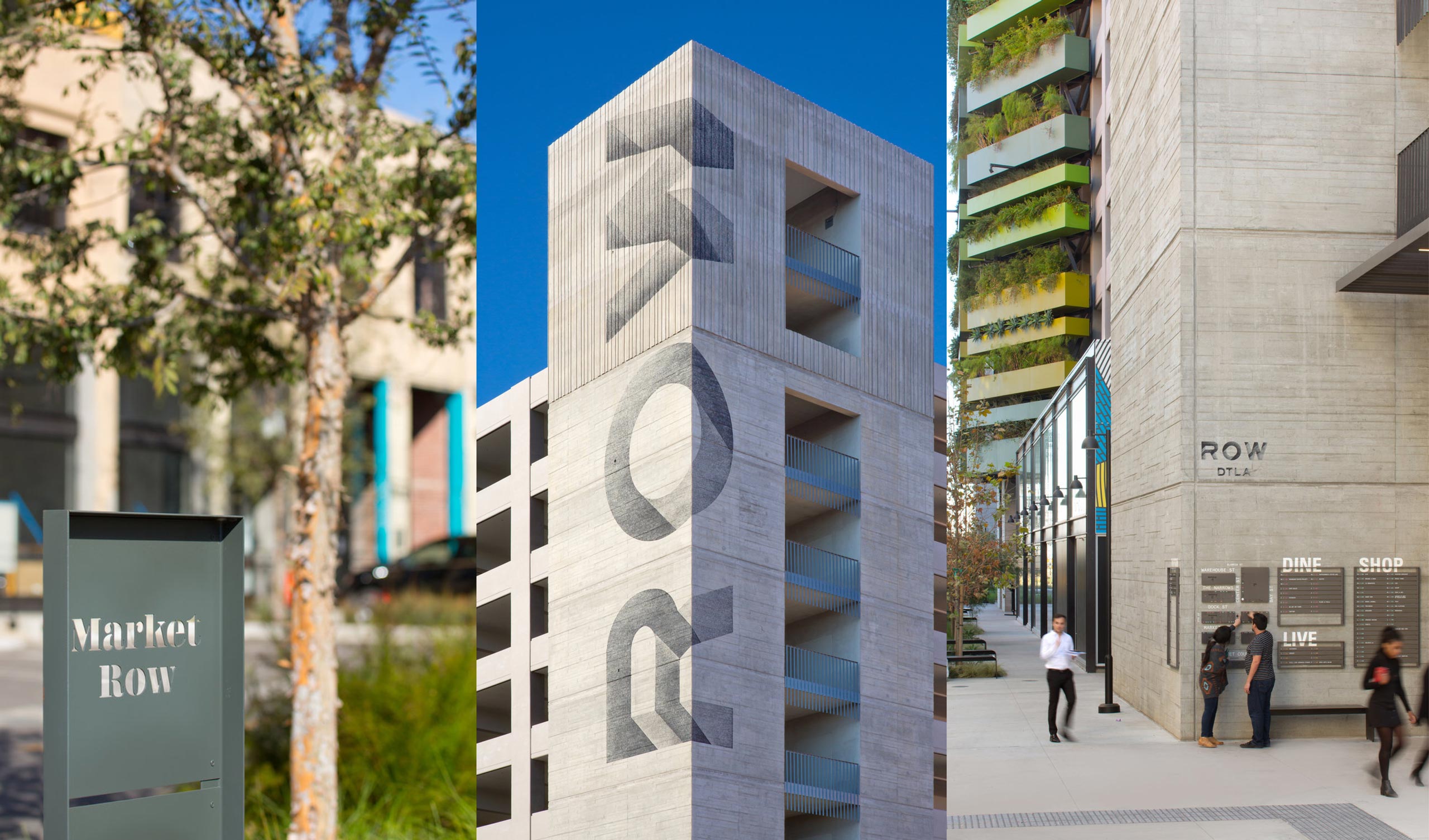
We did last what most developments put first — and looking back that is the way it should be more often. The external expression of identity is a beacon to the public that draws attention and confirms arrival, but is all the more authentic because it was designed as an expression of what was happening within, instead of as the first priority.
Place-led branding is one way we are moving towards honoring the past while recognizing the need for change, especially in places like Los Angeles where needs are changing rapidly alongside demand. Place-led branding tells us that, in essence, sometimes the Place is the Story.